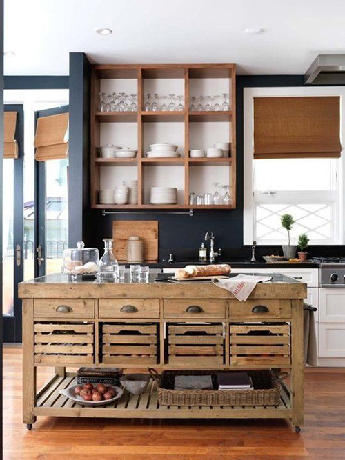
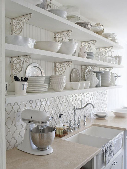
Open kitchens are a modern connotation, and have more aesthetic appeal than a normal, closed off kitchen. It is a trend inspired by the mid-century turn of the design timeline, when modernism was at its peak, and showcasing functionality by minimizing the use of material was a big rendition of style and sensibility. Similarly, open cabinetry is a trending tradition in the era of today, not because of its functionality, but mostly because of its aesthetics. There is something so very vintage, as well as modern about the idea of a beautifully design open cabinet shelf, that inspires one to rid the clutter, and be a pragmatic organizer. In this article, we would be discussing some open cabinet designs, which are both functional, pragmatic, and beautiful.
1. Unassumingly Natural
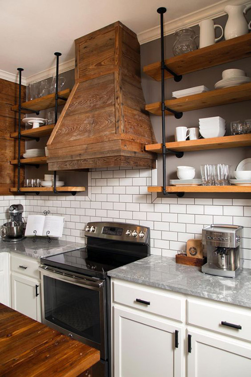
Straightforward, and easy on the eyes, this open kitchen cabinet design is decidedly elementary, but completely functional. The use of wood, against the black of the rods is beatific, and the overall color scheme is decidedly industrial. The texture of the wood is what highlights this open cabinet from the rest of the kitchen, and its match with the hood is an appropriate nod to the design principles of color, harmony, and rhythm. Aside from that, it is a beautiful way to showcase the best of your china, crockery, and cutlery.
2. Orthodox
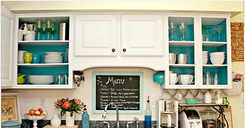
This open kitchen cabinet would work in the small style. It is conventionally classic, with beautiful, aqua, white, lime green, and silver accents – the aqua backsplash to the white cabinetry is quite contrasting, and surprisingly pleasing in aesthetic. The construction style is neo classical, with small trimming of entablature, and classic integration of wainscoting. The one closed cabinet provides an interesting juxtaposition to the open cabinets, and the contrast is quite alluring in appeal.
3. Idiosyncratic
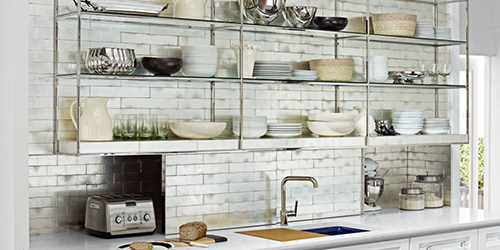
A clever amalgamation of vintage, kitsch, and industrial styles, there is nothing specifically designed about this open kitchen cabinet set, but at the same time, each and every nuance is deliberately detailed in both aesthetics, and functionality. The used of textured, layering of brick behind, and below the cabinet is very distinguished, and adds a touch of chic to the entire ensemble. The singular holding feature of steel skeleton that makes up the entirety of the cabinet is also an alluring feature. Both the backdrop, and the foreground match, despite the collocation of textures, and the overall result is decidedly exquisite.
4. Penny Plain
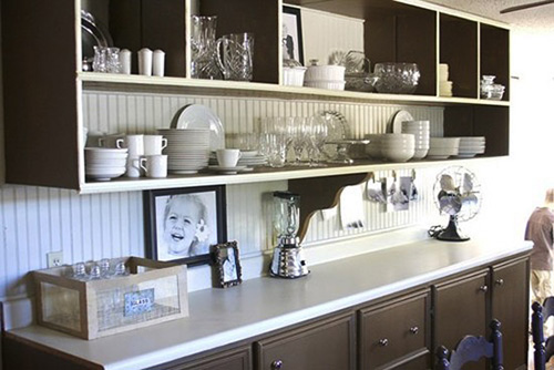
This one is a bit more on the conservative side, in that it is a mixture of both open, and closed – and the openness in this case is in the showcase style, which is rather orthodox. As far as design is concerned, there is no elaborate technique or style which would set it apart from most, but the clean cut lines, and sensible approbation are sensible in a quiet, modest, and plain way. The color scheme is traditional, and if you’re looking for something middle-of-the-road, then this would be the perfect choice for you.
5. The Vintage Queen
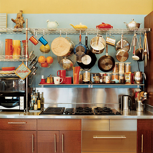
This most discerning feature about this is the holding hooks attached to the flat shelves – not only do they present infinite design possibilities, they make for a retro touch, that inspired the user to explore all the stylistic opportunities that could be achieved by hanging different utensils, in various colors over each and every hook, and what the end result might look like. Over all, the design is functional, as well as pragmatic – with that huge gap between each shelf to accommodate the anthropometry of the pots and pans.
6. The Hunker Corner
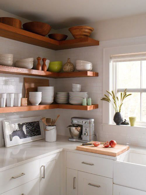
This open shelf solves that pesky problem of making use of those otherwise hollowed and useless spaces inside the corner of every standard closed cabinet shelf. The thick slats of wood make for a clever design feature that stand out against the textured white of the backsplash. Each shelf is located from the next at a regular interval that is specifically customized to hold stacks of plates, bowls, bottles, and even pots and pans. It might look like a conventional design as far as aesthetics are concerned, but its regularity makes it an effective choice.
7. Spice it up
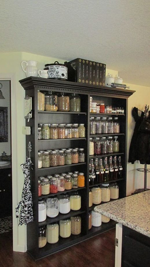
Now you can showcase your herb and spice collection in transparent jars, and put it on this customized wall mount shelf, which might, or might not become a feature in any home kitchen. Designed in the image of a showcase, the entirety is not however dressed in wood and cabinetry doors – in fact, its openness is what would make it stand out amongst the plethora of choices that you might have to compare against. The color black makes a bold statement, and would be an agent of contrast against the bright disposition of the spices.
8. Retro Sailing
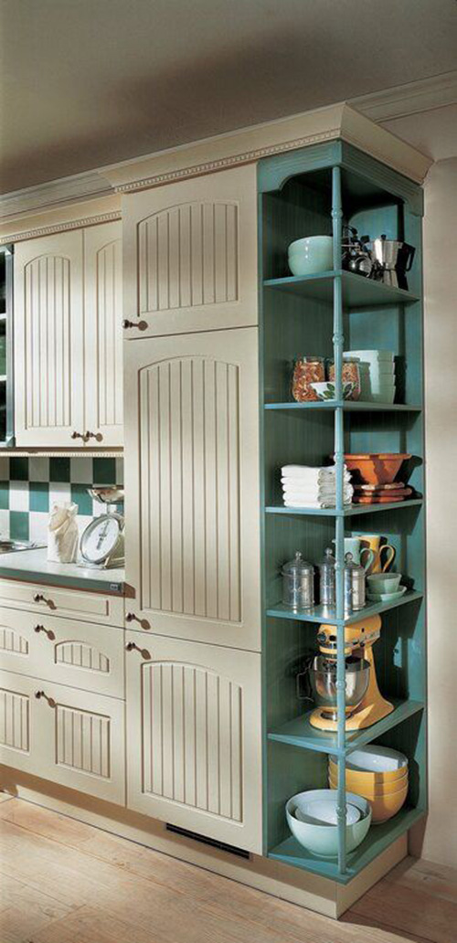
A traditional two-tone kitchen cabinet, this one is subtly retro – in that it depicts an evocative out of date passé that is very distinguished in design. It also combines the use of open and closed cabinetry style, which adds an additional panache, especially while considering the color scheme –a pastel blue and frost white. Both are cool, and yet, uniquely contrasting, and the solidity of the closed cabinet in terms of the shelving on the open cabinet is a welcome juxtaposition of design sensibilities.
9. Symmetry and unpretentiousness
The careful proportion and harmony of this open shelf is very simplistic, and very orthodox – and that simplicity is what makes the standard aesthetics of this design so very effective. The careful approbation of each boxy unit is so effortless, and manageable, it makes for a pragmatic and undemanding design, which, combined with the careful use of material and contrasting colors, is beautiful in its unadorned, and unembellished appeal.
10. Undemanding Sophistication
A deliberate amalgamation of classy sophistication, and traditionally neo-classic design, this design features stylistic corbelling, which, individually, make for such an appealing contrast against the stark, white austerity of the rest of the shelf. Each corbel support is uniquely designed in a wiry physique which is intricate and meticulous in design, and combines so well with the straightforward and plain finish of the shelving units.

