Designing a boy’s bedroom is not as conventional as designing a bedroom for a teen girl – while you can go slightly overboard while choosing items and furniture for a girl’s room, boy’s want their space to be uniquely utilitarian, and that makes it harder to choose one specific style that would cater to all the needs of their space, as well as satisfy their aesthetic. However, with farther advent in the field of interior design, and innovative product manufacturing, it is now becoming easier to choose furniture, and other elements that would make decorating boys’ room an adventure, rather than a chore. In this article, we would discuss some innovative bedroom furniture sets for a boys’ room.
1. Into the Convention
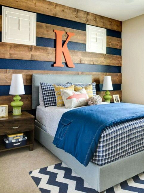
It is an unconfirmed myth, that boys like their paraphernalia in shades of blue – navy blue, to be more specific. So, following tradition, this is a rather orthodox proposition for a boy’s bedroom furniture set. The combination of navy blue paint, with the wooden slats add a contrast to the setting, while the powder blue bed, donned in leather, with a chic, modish headboard, make for an interesting dissimilarity. Add to that, the dark wood side table, and you’ve got yourself quite a disparity in the actual furniture set, but the setting, and ambiance make it work in the best possible way.
2. Compellingly Spartan
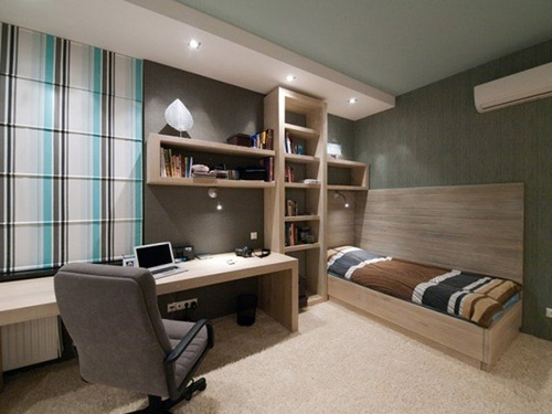
A bit on the modern side, this bedroom furniture set for a boy’s room is rather stark, and elementary. The design itself is straightforward, and unembellished, focusing more on functionality, and in the process, creating an aesthetic that is quite alluring in its unadorned, undemanding modesty. There is also a seamless convergence in the design, as the bed molds into the bookcase, which molds into the reading table – all of which is done with such effortless mastery that the design shows it in every line, and ever edge, without seeming apart from its whole.
3. A functional aesthetic
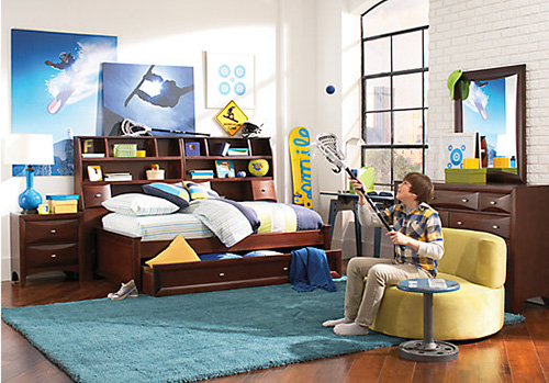
This one is simply conventional, in the way that classic furniture is – orthodox in its quiet simplicity. There is nothing very outstanding about the design itself, but when it merges the headboard of the bed with an unconventional storage, and showcase system, than it becomes a little something different. It is pragmatic in the sense that it provides small compartments to store away the clutter, and showcase prized possessions, memories, and odd baubles. The accompanying furniture is just as typical, as most of the bed, and wood makes it quite derivative in the grand scheme of things.
4. Dual Contrariety
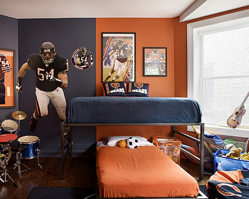
Adding the two for one sensibility to the design concept, this bedroom furniture set would have been quite unremarkable, had it not been for the actual placement of the furniture – one bed lying in verticality, beneath another bed set up horizontally. Not only are the beds freestanding, but the slim built of the material makes it uniquely industrial, and add the juxtaposition of alternating color scheme to the mix, and you’ve got yourself an uncanny contender for the win.
5. Understated Chaste
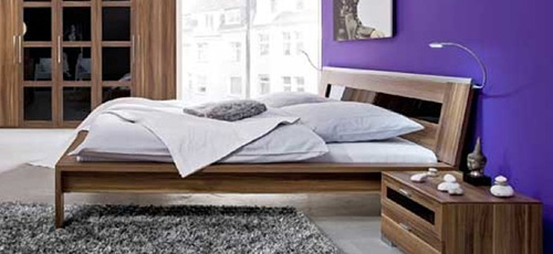
The plain backdrop is the perfect counterpart to this rather simplistic bedroom set. It is not exactly modern, neither is it minimalistic or contemporary. It does have a unique outlook, that is not quite solid, yet not quite transparent, and that collocation in visuals is what sets it apart from most other designs. There is also an austerity to this furniture set that is not yet complete – the starkness is not frigid, but is warm and compelling, attracting the user to its unique concept. The side tables are a welcome contrast in build against the semi solidness of the bed.
6. Setting up the Aura
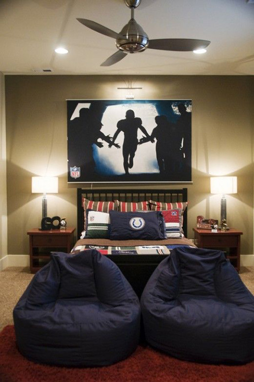
This bedroom furniture set might have been trite n design had it not been for the accompanying ambiance, the color scheme of the room, the drama of light, and the use of supporting paraphernalia a la the navy colored bean bags, and the poster/painting that had become the main feature of this room. Together, all these elements combine to create a disparity amongst all the features of the bedroom that are uniquely compelling. The furniture set itself is classic, and unremarkable, simple in its unpretentious, and unornamented beauty.
7. Smart Design
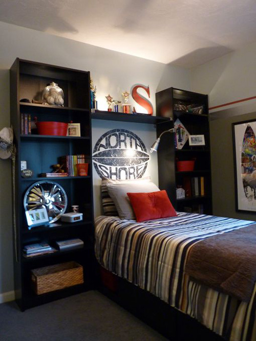
An alluring use of contemporary design, this bedroom furniture set for boys’ amalgamates aesthetics with pragmatism, by using the shelving unit for storage and showcasing instead of the side tables. The bed itself is simple, but combined with the shelving unit, it becomes something more, something better, and something more useful than its intended purpose. The shelving units could be used to showcase books, action figures, and other prized possessions that make up the repertoire of a boy’s room. Altogether, this design is alluring in its simple audacity.
8. Vintage Country
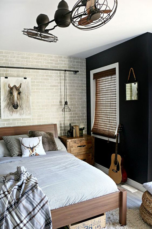
Not quite breaking tradition, this bedroom set leans more towards the vintage side – with its exposed brick wall, painted over with white, the flamboyant ceiling fan, and the use of black as a contrasting color scheme, it sets up quite an ambiance. The furniture itself is plain, with a simple bed, with a straightforward, undemanding design – an unadorned headboard, and an unembellished footboard. The side tables are blocky in physique, and short in stature. The overall outlook of this furniture set is country in style, and is uplifted mainly due to the ambiance of the room.
9. Dichotomy of tradition
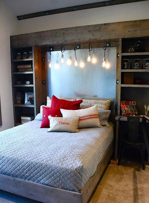
This one does break tradition – in that it used a color scheme that is not strictly ‘dark’ and typically conventional of a boy’s bedroom. It makes use of a popping color in the form of red pillows, which are balanced out by the use of white sheets. The furniture set has a dual purpose dichotomy, as there are no side tables; just a set of shelving units, one of which converges into a small reading table. In that, it is functional and pragmatic, with compelling aesthetics.
10. Come at Modern
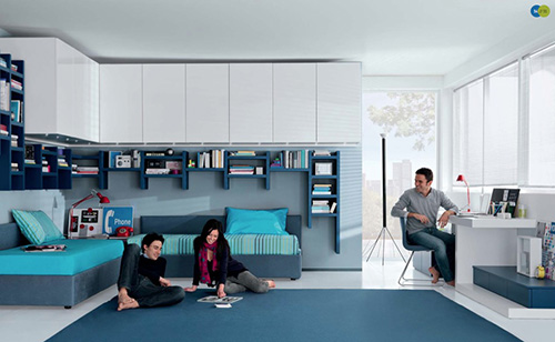
This bedroom furniture set is modern in style, and combines several tasks in single layer of furniture styling – the bed is also the couch, the cupboards morph into the book shelves, and the sofa seamlessly amalgamates with the bed set. Overall, the design is simple, but not elementary – there is a certain charm, and panache to the unpretentious sophistication of this design.

