Kitchen cabinets are a personalized accessory. Their complete outlook can define the aesthetics of any kitchen, so, it would be best to choose the design, and accompanying concept with care. Aside from being the ‘face’ of your kitchen, these cabinets can reflect on the personality of the user – its color, scheme, style, and probable outlook, are not the single handed work of a designer, but a combined effort of the professional, and the user, both; in that, a little part of the design scheme, comes straight from the owners heart. In this article, we would discuss ten of our favorite kitchen cabinets, which even you might fall in love with.
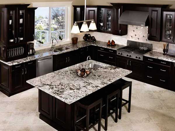
- In a kitchen design, simple, yet elegant is the way to go, and color scheme definitely matters. As demonstrated in this design, the light and dark color of the kitchen cabinets, compared to the countertops, create a unique drama, which makes it seem elegant, yet theatric at the same time. The contrast is only set off, with the correct placement of lighting. Additionally, the alternating design scheme of solid versus transparent between each cabinet is another unique quality of these cabinets – it saves the design from being a monotonous mess, yet still keeps it related, and conformed with the rest of the cabinetry styling.
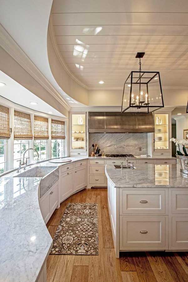
- What sets this cabinetry apart, is the light curvature in the conceptualization – not only does it take this design away from the monotony of a regular, square-ish, straight base, but adds an elegant panache that exudes a sophisticated sort of chic. The white of the cabinets is only highlighted by the long line of windows that let in ample sunlight, and not only diverge the space by collocation of color scheme, but make it seem exquisitely alluring. In this design, there is no contrast between the cabinetry and countertops, but there is a graceful dissimilarity between the floor, and the cabinets, which makes the interior stylish, and tasteful.
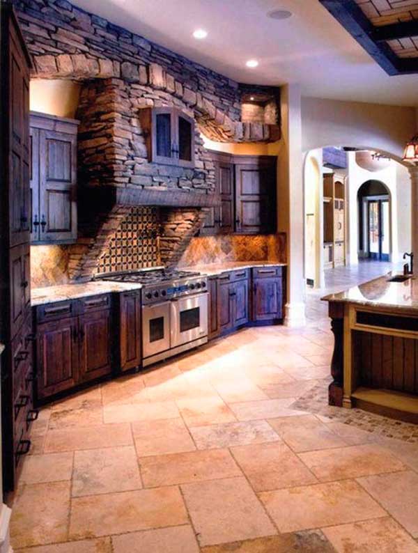
- This country style kitchen with accompanying cabinetry, may not be one of a kind, but this style definitely comes few and far in between. The stone hood with its centerpiece cabinet is makes for an interesting feature that is in concordance with both aesthetics and functionality – you could use that cabinet for storing all the essential needed for cooking – spices, small cutlery, etc. the rest of the cabinetry is in complete contrast, not only according to material, but also visuals – but the discrepancy in texture only seems to articulate the uniqueness of the design – a rough, Arcadian, prairie style.
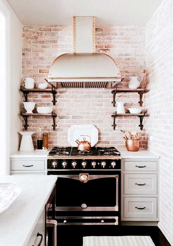
- This small style kitchen is a rustic sweetheart, and its sleek, tasteful cabinetry only seems to add to the design itself. A complete contrast of black and white, rustic and modern, this cabinet style is a mixture of open, and closed. The open one add to the aesthetics, while the closed ones add to the functionality, and together, they create an overall outlook that is both charming, and alluring. The single key element, that brings out the design of this kitchen is the distressed brick backwash, that brings out the antique design of the open cabinets, and help showcase the utensils in a more authentic, and stylish way.
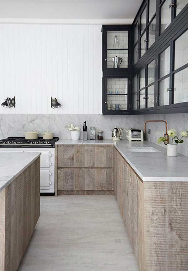
- This cabinet style is a canny amalgamation of vintage and modern. The sleek lines running the gamut of this design are what set it apart from most, and yet add that ubiquitous touch, that is so commonplace for the modern style. Another thing that sets it apart from most designs is the careful, and clever use of textures – not only do they give this design character and integrity, they make a layout of an otherwise bland blueprint; especially the layered bricked texture behind the glass doors of each cabinet. It highlights the utensils to be displayed, and adds an element of curiosity.
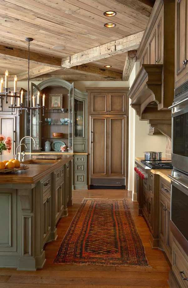
- If you’re looking for a more authentic sort of vintage, than this would be the perfect candidate – with a powdery shade of blue, on a distressed, antique classic island, and a shabby, wooden ceiling, it exudes a firm juxtaposition of old and new, at the same time. The cabinets themselves vary in color, and that is one of the foremost design touches that set them apart – the golden brown of the base cabinets, combined with the pastel blue of the island and showcase, make for an uncanny combination that works in the best way possible. The smooth curvature of the classical style of entablature is one more thing that adds to the retro feeling of this cabinet set.
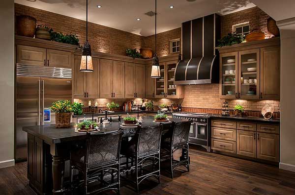
- If you want wooden cabinets that are not only attractive, but also graceful in their subtle appeal, than this is one of the top picks from the lot. The top cabinets are elongated, and more narrow in design, giving the illusion of an added element of storage and functionality, while the two glass cabinets on either side of the hood, add an element of show casing in the design, while going easy on the pretension. The back splash of brick, combined with the gold of the backlighting adds a wonderful warm glow to the entire setting.
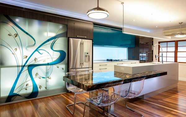
- A stunning combination of modern and contemporary, this kitchen set mostly uses straight lines and sleek edges to give off an edgy vibe, but the use of the backlit contemporary design, and the bright, vibrant cerulean makes it a bit contemporary, in the best possible way. The cabinets are very subtly hidden inside the design itself – no handles, and such, but the overall look, is quite aesthetically pleasing.
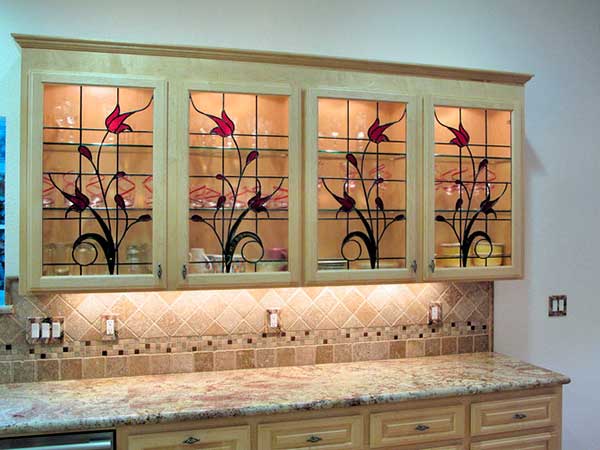
- Stained glass has always been a stylistic opportunity to make the best decorative feature out of everyday design works, and adding a touch of glassy paint to your kitchen cabinets with a stunning back light is the perfect way to make your kitchen cabinetry stand out amongst the rest of the brood.
- This shabby chic kitchen cabinetry gets its unique outlook from the distressed wooden paint that gives off a rustic sort of appeal. The combination of golden with a dark green cover makes for an interesting combination, which, in the gold of this specific lighting, highlights the allure of this unique texture, making it look graceful.
